Featured

Patagonia logo

This is the post excerpt.

I received a catalog from Patagonia, the outdoor clothing company. The cover is a dramatic photo with the name of the company in all lower-case. The font has high contrast stroke weights, interesting serifs, and a binocular lower-case “g” that is unique and has lots of personality. I used WhatTheFont to research what typeface it is based on the letterforms. The top suggestion is Belwe SH designed by George Belwe, about 1915. MyFonts describes it as “Deliberately unusual proportions and detailing break with traditional rhythm and hint at blackletter connections.”

whole-group-for-post
clockwise from upper left: catalog cover, logo, WhatThe Font suggested results, identifying letterforms

Typographic Ornament

screen-shot-2016-12-17-at-3-37-42-pm

One type of ornament that stuck out to me is the ornaments in the typeface of Bodoni. I think these are extremely decorative and can have several uses.

Bodoni was created by Giambattista Bodoni.  Bodoni’s typefaces are classified as Didone or modern. Bodoni had a long career and his designs changed and varied, ending with a typeface of a slightly condensed underlying structure with flat, unbracketed serifs, extreme contrast between thick and thin strokes, and an overall geometric construction.

Examples of how these can be used are in several ways like a calendar, a book cover, or even as a design element to emphasize a graphic.


screen-shot-2016-12-17-at-3-37-52-pmscreen-shot-2016-12-17-at-3-38-04-pmscreen-shot-2016-12-17-at-3-38-15-pm

9th Blog Post

Screen Shot 2016-12-17 at 3.18.53 PM.png

In looking at https://www.typewolf.com/resources. I came across the typographic blog section. I think this is especially important because it’s a reflection of exactly what this blog is about which is looking and analyzing typography. On this website I took a look and scrolled through different blogs and came across some interesting things and type. I think it’s worth looking into because you can get an insight on exactly what other graphic designers are doing when it comes to typography. Screen Shot 2016-12-17 at 3.27.10 PM.png

Online Font Libraries

For the different typefaces I decided to go with Google Fonts because they have a wide variety and it’s very easy and accessible to all.

Screen Shot 2016-12-17 at 3.10.06 PM.png

I chose two typefaces – Monserrat and Slabo. A serif and sans serif. Just common knowledge they both are very complimentary to each other.

I decided to type out “Typography Fall 2016” as a heading with each typeface accordingly and they complimentary.
Screen Shot 2016-12-17 at 3.03.06 PM.png

In looking at text as a whole with chunks you can see the statement above continues to prove true.


Screen Shot 2016-12-17 at 3.15.42 PM.png

Expressive Type – Flow

Screen Shot 2016-12-17 at 2.29.53 PM.png

In looking at this graphic that focuses on motion. When I see the colors chosen and the word I think the design was able to show motion. The form of blue express and show water and with the words “Just Go With The Flow” it reflects the motion of the water. I think the use of white was a good choice because it balances well with the blue. My eye follows through with the “water”which “flows” through the ocean.


Table of Contents

screen-shot-2016-12-17-at-2-17-49-pm


In looking at this grid I can see a modular grid is present. I REALLY enjoy this table of contents specifically because of the contrast. The way the words and colors stick out is very distinct and visually appealing. An abundance of typographic emphasis is placed in the spacing, which should be expected when using a grid but it just flows so nicely. The visual message that is sent that would make me want to spend more time with the book and magazine is that it’s inviting me with words like “whats inside” or “perspectives.” I think this is an extremely successful example of use of an underlying grid.


Peer Review Specimen Books – Kassidy Kievit

Screen Shot 2016-12-17 at 2.06.33 PM.png

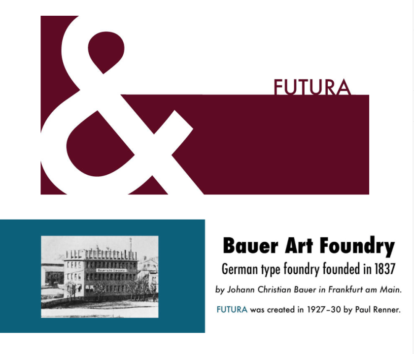
I  decided to take a look at my peer Kassidy Kiev’s specimen book. I really enjoyed the colors she used. they complimented each other very nicely. I also enjoyed the elements she used when designing this specimens book. The designer achieves the personality of Futura through the use of shapes and placements on letters in a very modern way. Through the entire class I learned about Futura and I realized it is one of my favorite typefaces – in looking at this specimen book the favoritism increases! I think this specimen book was extremely successful and Kassidy did a great job in creating elements that resemble Futura.

screen-shot-2016-12-17-at-2-07-42-pm


Typographic Ornaments

I found these glyphs that are included in a book called “The Little Book of Typographic Ornaments” by David Jury. The ornaments in his book date back to the 1700’s and are from the type foundries and specimen books of that time. These ornaments are very beautiful and elaborate. I could see these on a very lavish wedding invitation or a very nice hotel logo/identity.ornaments-blog

Blog Post 9

For this blog post I discovered and learned about fonts.com. What I’ve found and actually purchased from Fonts.com is an online subscription that unlocks thousands of fonts for a mere 15$ a month. In the past I’ve always found the differences in font lists across different computers to be a problem, especially when dealing with work horse fonts like Helvetica and Frutiger. With the subscription from fonts.com, most work horse fonts, and a ton of other fonts become available to use and work with at the click of just a button. Once installed on your computer, their program will sync whatever fonts you choose online with your computer and will allow you to use them in an instant. What’s especially useful to me was that it can be used across multiple computers as well, so when dealing with a unique font at home, I can also work on the same project in class or on campus. Fonts.com not only made working across multiple platforms easier, but unlocking thousands of fonts that i didn’t know existed was also quite pleasant.

10th blog post : Minion Pro Ornaments

blog-post-10-fonts-with-ornaments-minion-pro

Above are some of the ornaments that can be found in the Minion Pro font family. Designed by Robert Slimbach in 1990 for Adobe Systems, these ornaments were consciously given the character of being hand-drawn. With how beautiful and unique these ornaments look I feel they can be used in a wide variety of places, I personally chose to use the heart ornament in one of my business card designs. I can definitely see myself using them more in the future.

blog-post-10-business-cards-pic-1